55The Brief
The BBC had a lot of data from the Iraq and Afghanistan conflicts that related to casualties. The brief was the take this data and tell the full story across the two wars to BBC users.
Delivery
+ Using the timeline format meant the audience could really dive deep into the statistics to make a more narrative product
+ Complex data sets were easily comparable by using simple bar charts familiar to the majority of users
+ The addition of a map added another layer of richness to the offering allowing insights like casualty discrepancies across North/South divide in the UK
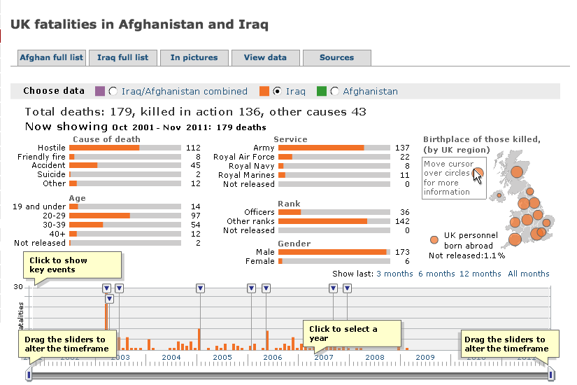 Interface for v.1 of project. User can break down data by Iraq, Afghanistan or both wars combined.
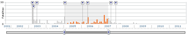 The interface is driven by an interactive timeline, the data can be broken down by month or years.
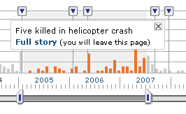
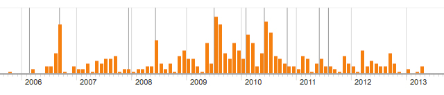
key events would cause spikes across the timeline. Info panels were added to give context.
 To keep things simple and allow data to be easily compared only 1 form of Data visualisation is used. Bar charts provide the most accurate representation.
V.2
The original project was designed and released in 2007, by 2010 a lot had changed. Technology had moved on (flash was no longer being used) and the BBC News site been widened from 786 pixels to 976. The Story was still very current, and the project was due an update.
 The first major change was to remove the timeline controls and simplify the experience, the data was presented up front without the complexity of an interactive timeline.
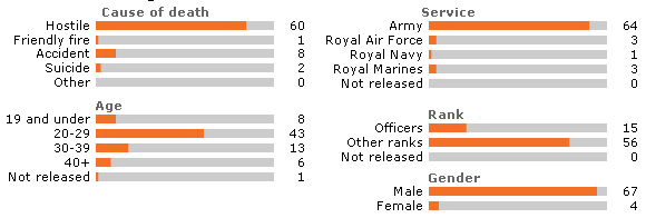
 A menu was added to allow users to filter by ’cause of death’ the big story was how soldiers were dying, we wanted users to be able to look at this data in isolation with the context of a timeline.
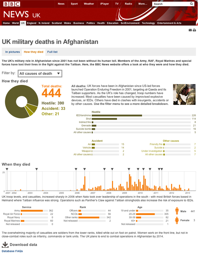 Final interface: Key information is given priority, and supporting information is moved further down the page. V1 focused on allowing the user to interrogate the data and find the stories. In V2 we wanted to tell the story, and provide more context.
Note: The BBC has recently released a responsive website across news, this interactive is no longer displaying. You can view version 1 here: http://news.bbc.co.uk/1/hi/uk/7495440.stm