The Brief
The BBC teamed up with sociologists from leading universities to analyse the modern British class system which was not fit for the 21st century and needed revitalising. We wanted to create an interactive infographic that would let people see how they fit into the new class structure as well as being a real talking point and very shareable for social media.
Delivery
+ Making the interface that was fun and compelling to package the results of this research into an exciting offering
+ A transparent navigation that showed users where they were in the process
+ Signposting that made sharing quick and obvious, the Great British Class calculator received 350,000 shares in its first four days and was the widely shared graphic across the whole of the BBC
 Simple for step navigation shows the user exactly where they are within the calculator and how many steps are needed to complete it.
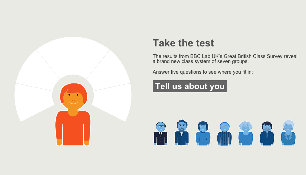 Clear intro text and call to action to take the survey
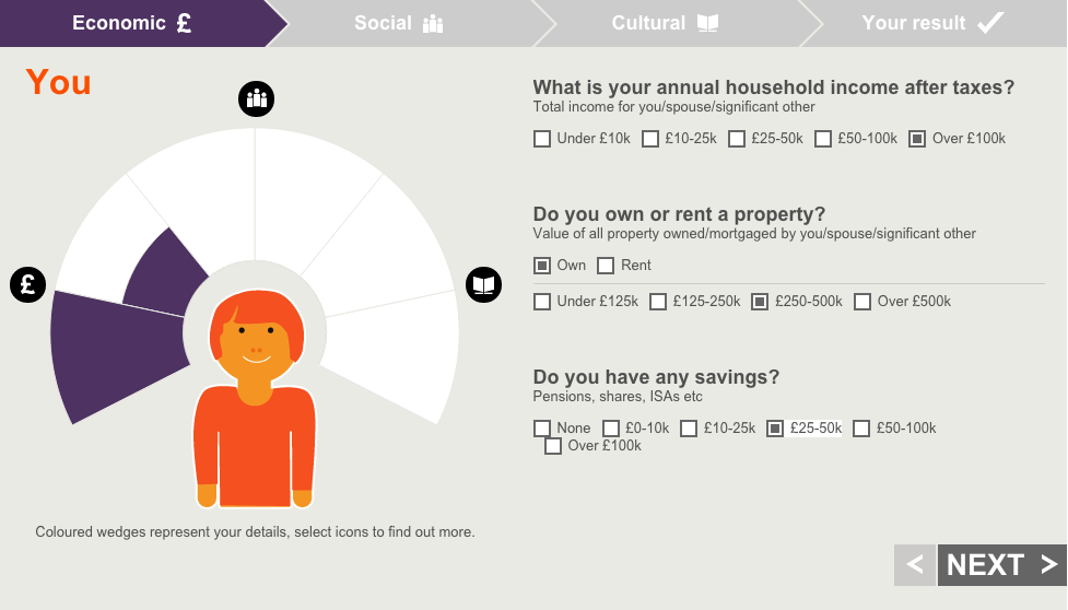 Pie chart populates live based on survey results.


Back and next functionality keeps the user in control at all times
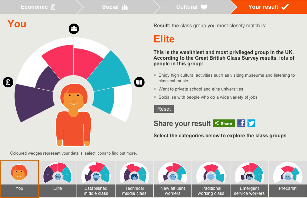
Completed survey
![mobile]](http://www.harjitkaura.co.uk/wp-content/uploads/2013/04/BBC-class-mobile2-IMG_6385-512.jpg)