The Brief
Some words feature prominently in every US presidential State of the Union message, others come and go as events dictate or fashions change. Leading up to President Obama’s State of the Union message, we wanted to visualise the top ten occurring words throughout the history of the speech.
Delivery
+ A graphic that showed the top ten words, and effectively visualised frequency and word count
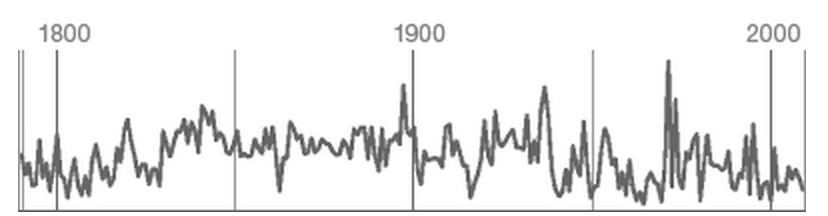 Using sparklines to show frequency
Influenced by Edward Tufte
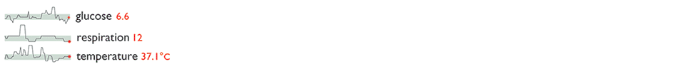
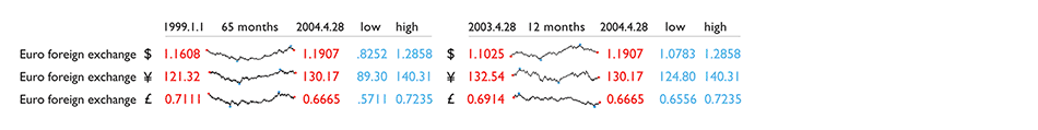
These little data lines, because of their active quality over time, are
named sparklines—small, high-resolution graphics usually embedded
in a full context of words, numbers, images. Sparklines are datawords:
data-intense, design-simple, word-sized graphics.
From Edward Tufte. Full post here.
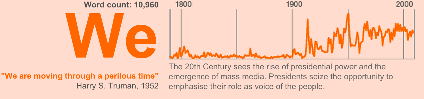
Showing frequency of occurrence alongside word count. Context is added to the graph with some historical information.
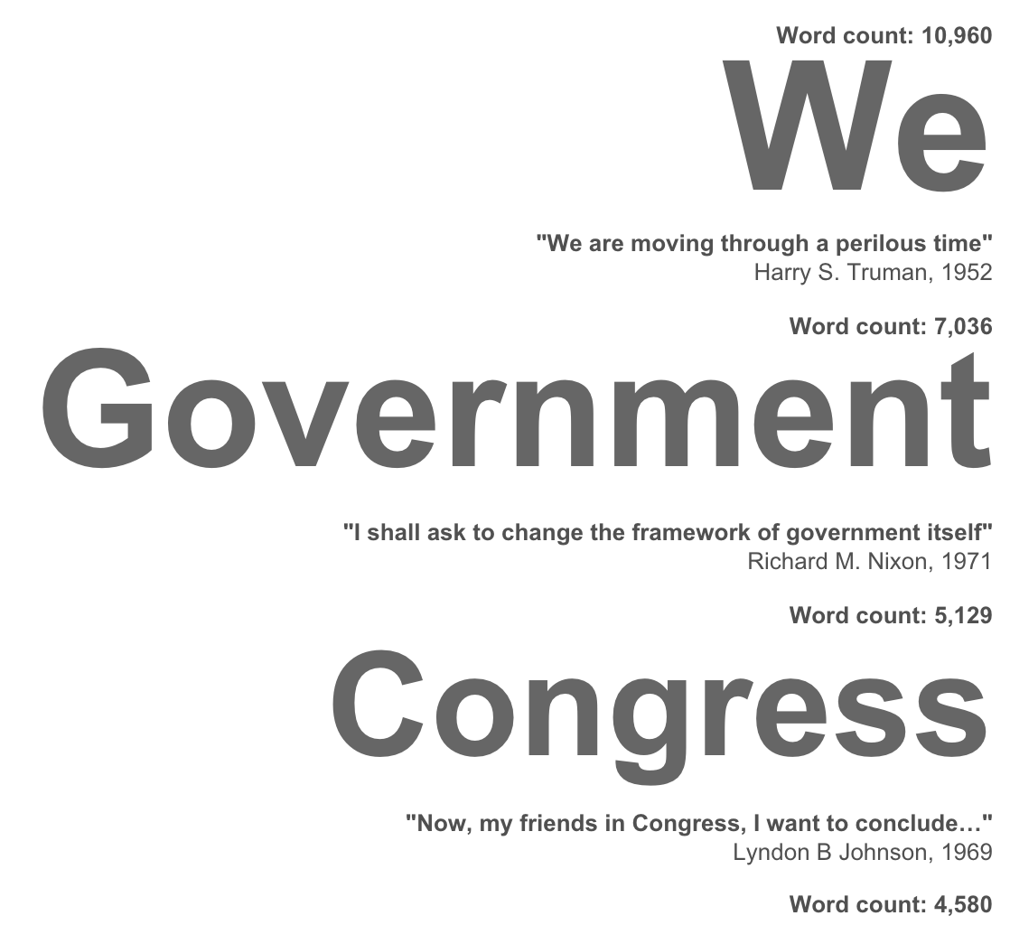 Words are stacked down the page and scaled based on count, scaling the words reinforces the idea that they are ranked from high to low, negating the need to number the words
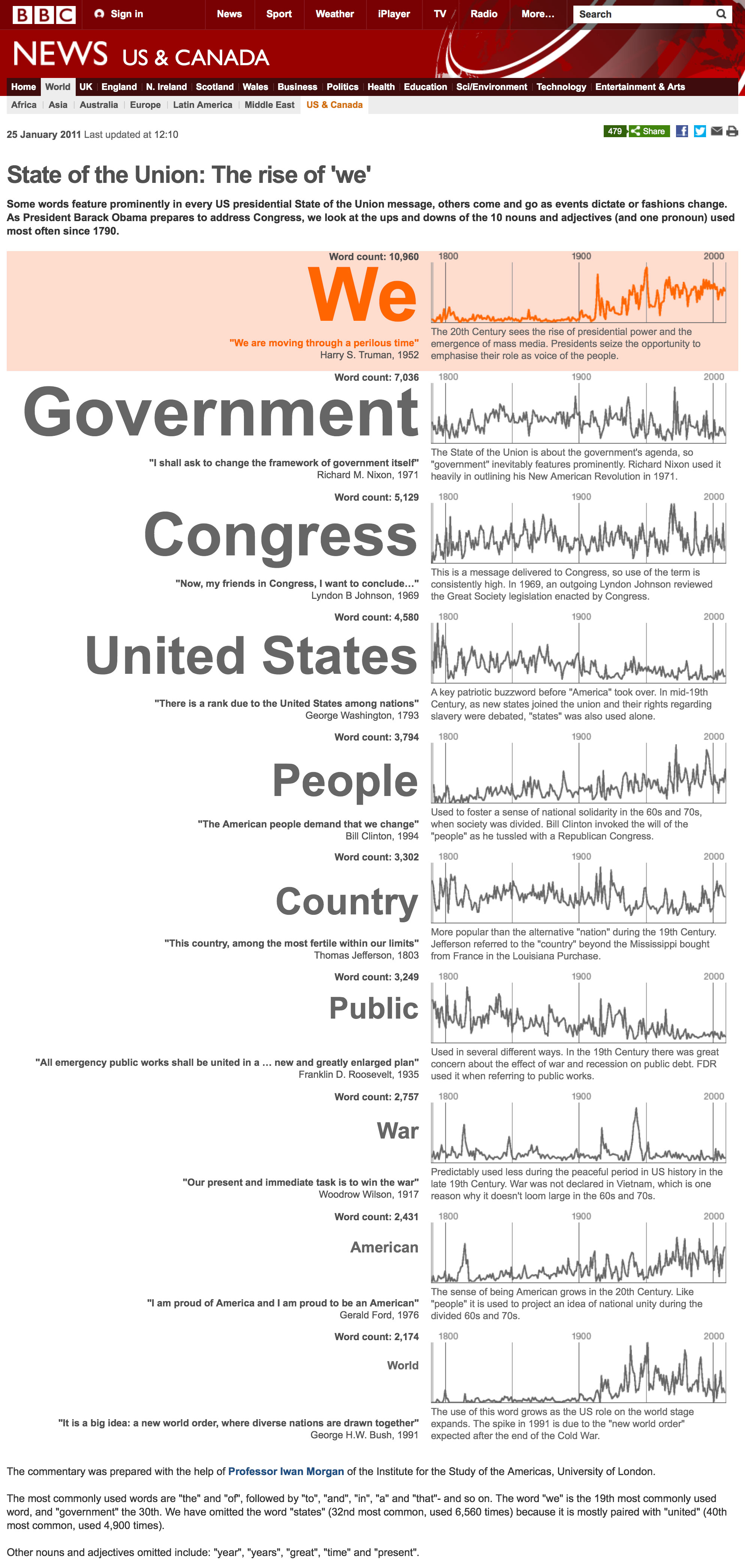 Final graphic